Clear treatment discovery
Treatments are organised into recognisable categories, with a clear path from the main services overview to more detailed information and prices.

A calm, approachable digital experience designed around treatments, trust and ease of use.

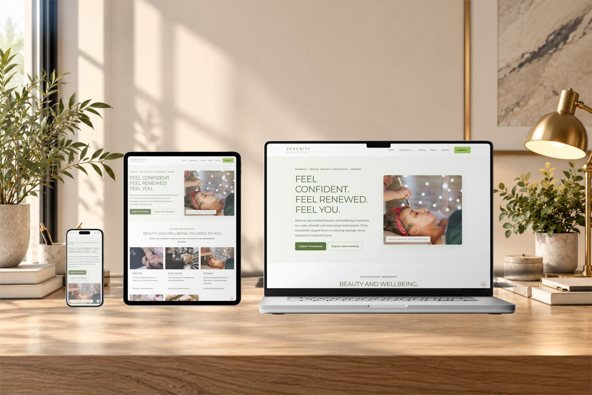
The Zerenity website demonstrates how a beauty, health and aesthetics business can bring a varied treatment menu into one welcoming, easy-to-navigate online experience. The design places the services themselves at the centre, while giving visitors enough context to understand what is available before making an enquiry.
Rather than relying on a single promotional landing page, the approach uses a structured multi-page website with clear routes to treatments, prices, the practitioner’s introduction and contact details. This allows the visual identity to feel calm and premium without sacrificing the practical information people come to find.
The design direction pairs a gentle green-and-ivory palette with considered typography, generous whitespace and relevant treatment imagery. The intention is to create a professional, reassuring atmosphere that suits a personal beauty and wellness service rather than a generic corporate website.
Consistent headings, buttons and content spacing help different treatment pages feel part of the same brand. Services are grouped into recognisable categories, so a visitor interested in a particular treatment can find a useful starting point quickly, then move to pricing or contact information without having to search through unrelated content.
Treatments are organised into recognisable categories, with a clear path from the main services overview to more detailed information and prices.
Layouts, spacing and navigation adapt to phones, tablets and desktops, keeping treatment details and enquiry routes accessible across screen sizes.
An introduction to the practitioner gives the brand a more personal presence and helps visitors understand who is behind the services.
The website experience was planned as a connected set of pages, not simply a decorative homepage. The homepage introduces the brand and highlights the main treatment areas; dedicated service pages provide room for further explanation; and pricing, About and Contact pages support visitors who want to compare options or get in touch.
Particular attention was given to how someone moves between these sections. Clear navigation and consistent page layouts reduce unnecessary steps, while responsive styling helps the same experience work on a mobile phone, tablet or larger desktop screen. The result brings together visual website design and practical front-end implementation.
Let's create an online presence that feels right for your business and makes it easy for customers to get in touch.