Elysium Aromatherapy
Brand identity, luxury packaging, print design and a customised Shopify storefront.
One brand. Every touchpoint.
Elysium Aromatherapy brings together perfumes, candles and home fragrance. The project brings its identity into the physical and digital world through coordinated packaging, printed pieces, product imagery and a customised Shopify storefront.
A recognisable luxury identity
Establish a consistent look that feels premium across products, promotional materials and the online shop.
Consistency in the details
Use gold accents, expressive serif typography and complementary light and dark palettes across different formats.
From packaging to Shopify
Bring the system to life through carton artwork, a 20-page catalogue, gold-foil business cards, fragrance inserts, product visuals and existing-theme customisation.
A complete e-commerce website, designed around the brand
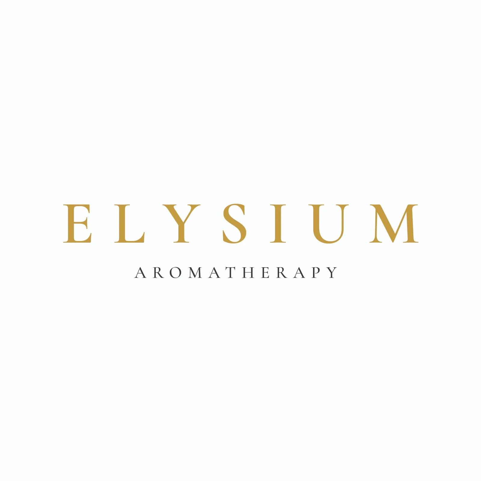
The Elysium Aromatherapy website was designed and built around the customer journey, using Shopify as the e-commerce platform. Starting with an existing Shopify theme, I customised the storefront’s appearance, page layouts, navigation and presentation to create a cohesive online experience for the perfume, candle and diffuser collections.
Designing the complete storefront
The work covered the website’s overall visual direction, from typography, colour palette and photography to the homepage layout, collection browsing and product presentation. I organised the content and navigation to help visitors discover the different ranges and move naturally from browsing to shopping.
Responsive layouts were considered throughout, so the same design works across desktop, tablet and mobile. Product photography, supporting graphics and brand details were brought together to make the digital storefront feel consistent with Elysium’s packaging and printed materials.
The result is a fully branded Shopify shopping experience, developed through theme customisation rather than a bespoke platform built from scratch.
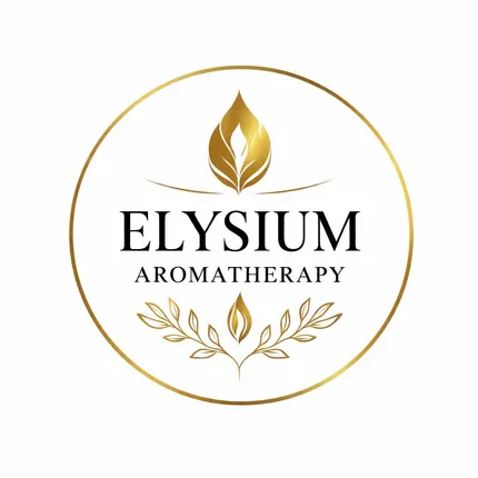
A distinctive visual identity
Gold serif typography, a botanical emblem and adaptable logo treatments establish a recognisable look across packaging, print and digital touchpoints.
Designed for the physical product
A coordinated dark-and-gold system applied to the perfume carton and bottle label, with carefully arranged product information and fine border details.
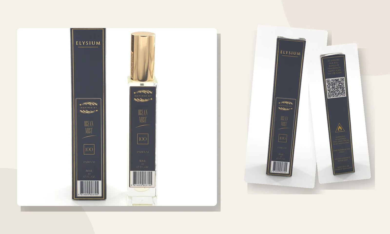
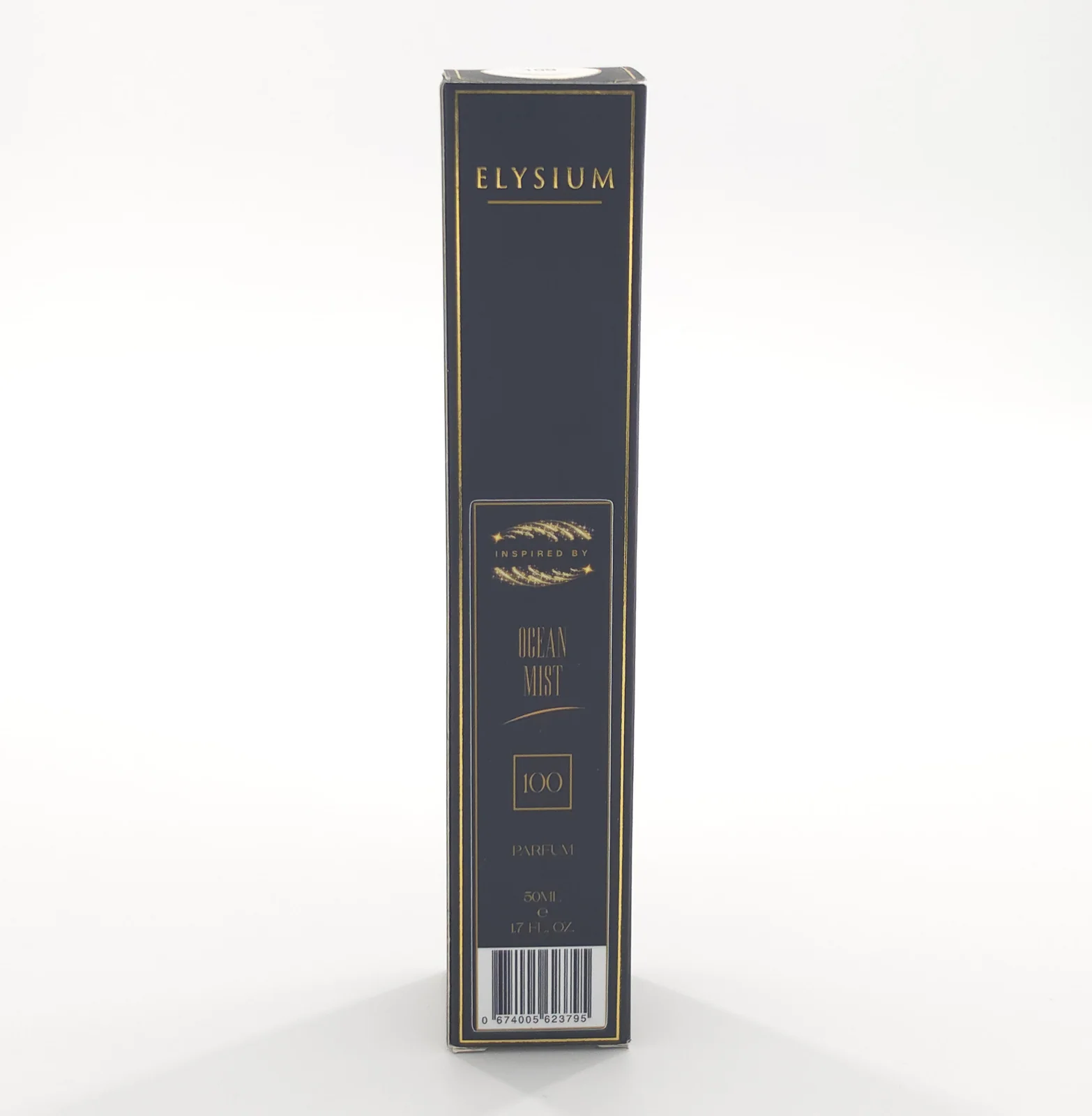
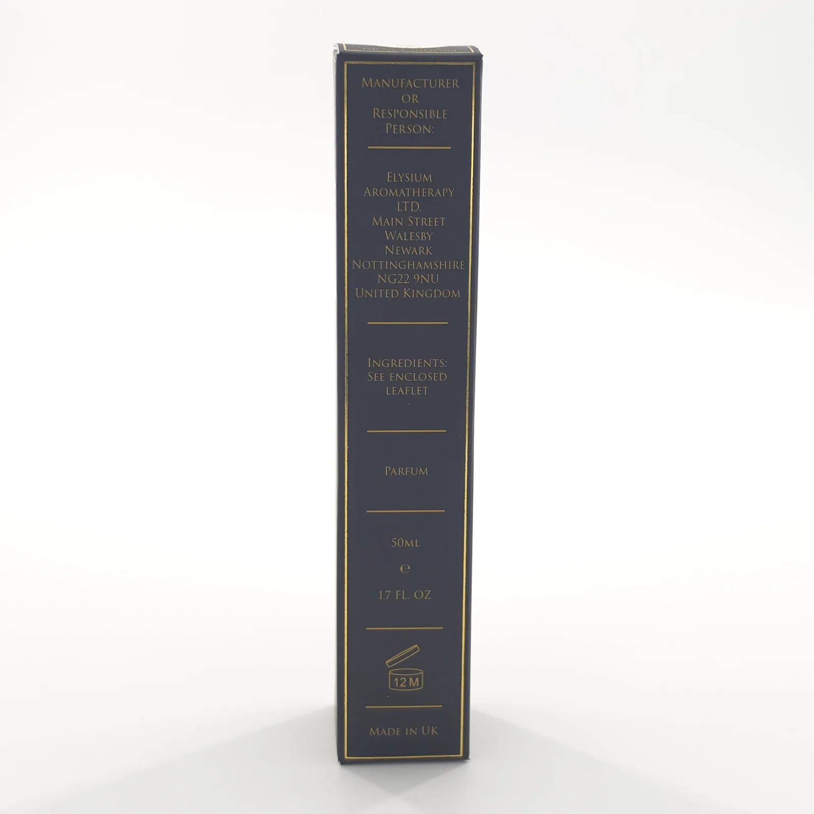
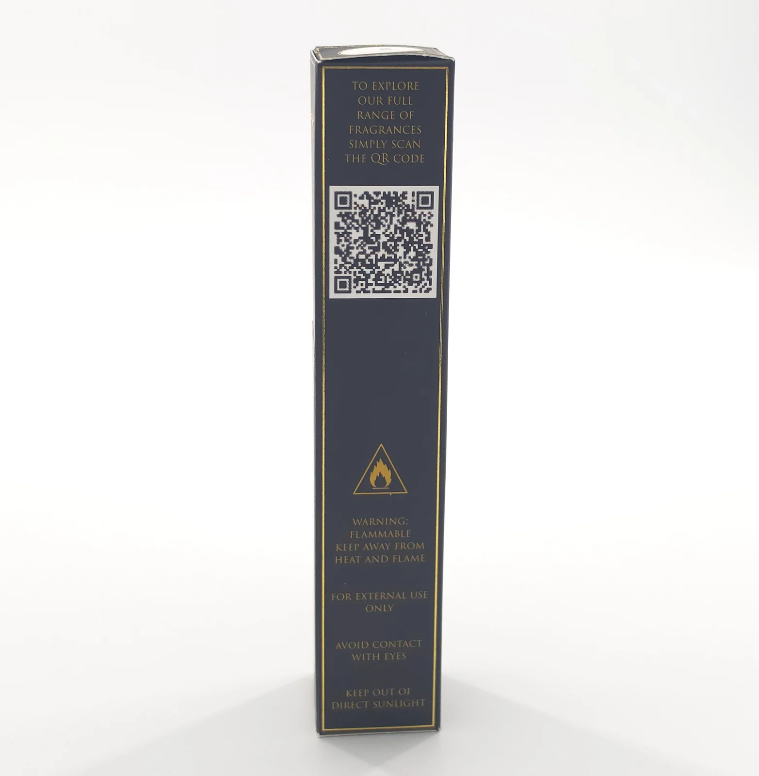
From carefully laid-out carton panels to the finished bottle and box, the packaging carries the same black-and-gold visual language throughout.
Print that carries the brand through
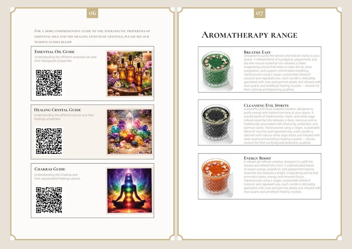
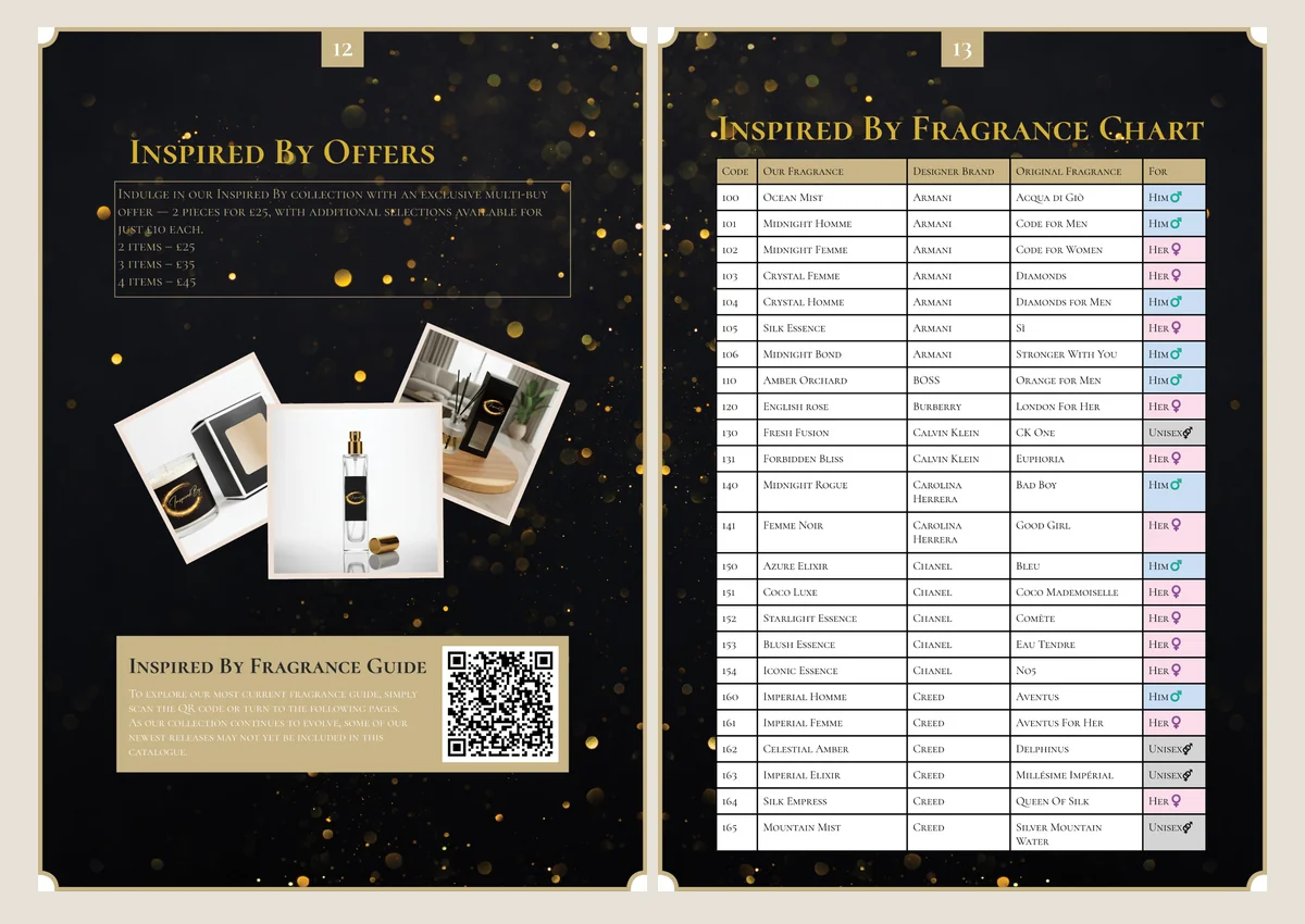
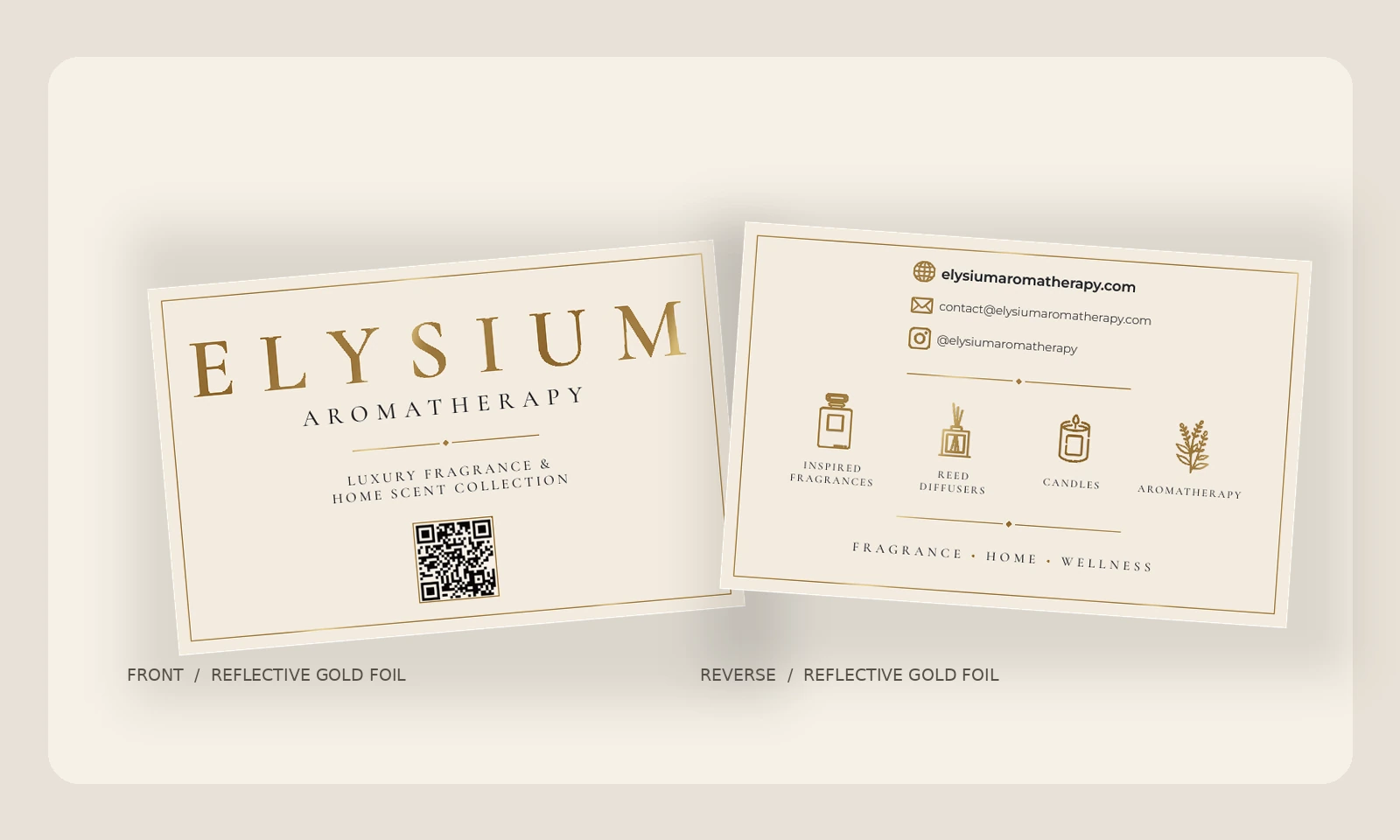
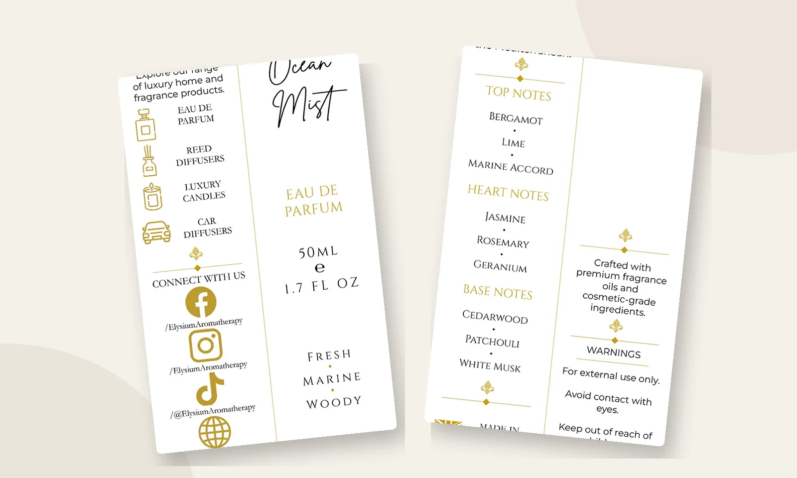
From fragrance information inserts to business stationery and a multi-page product catalogue, the printed pieces retain a consistent typographic and colour language. The business cards use metallic gold foil, shown with a simulated reflective gold-foil finish applied to the original gold elements.
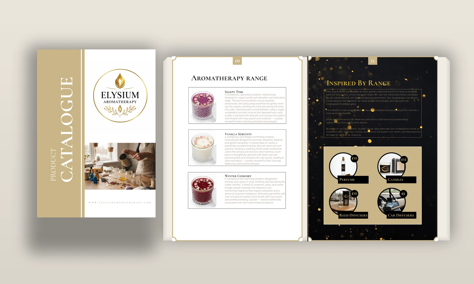
Inside the catalogue
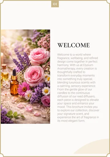
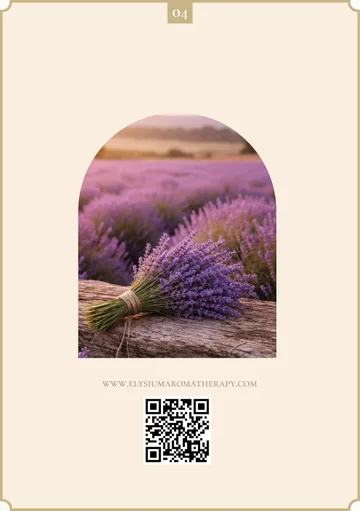
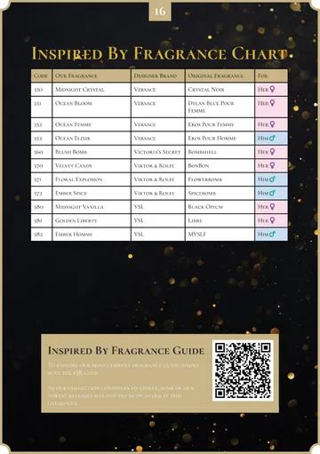
Explore the range of layouts across this 20-page publication, from soft cream-and-gold product pages to the dramatic black-and-gold fragrance collection.
Two creative directions, one product
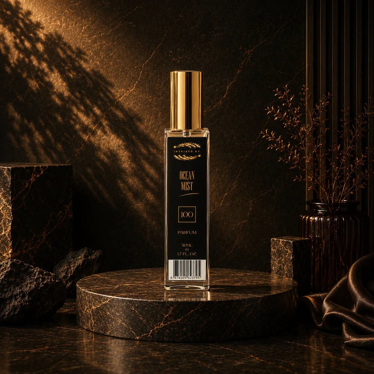
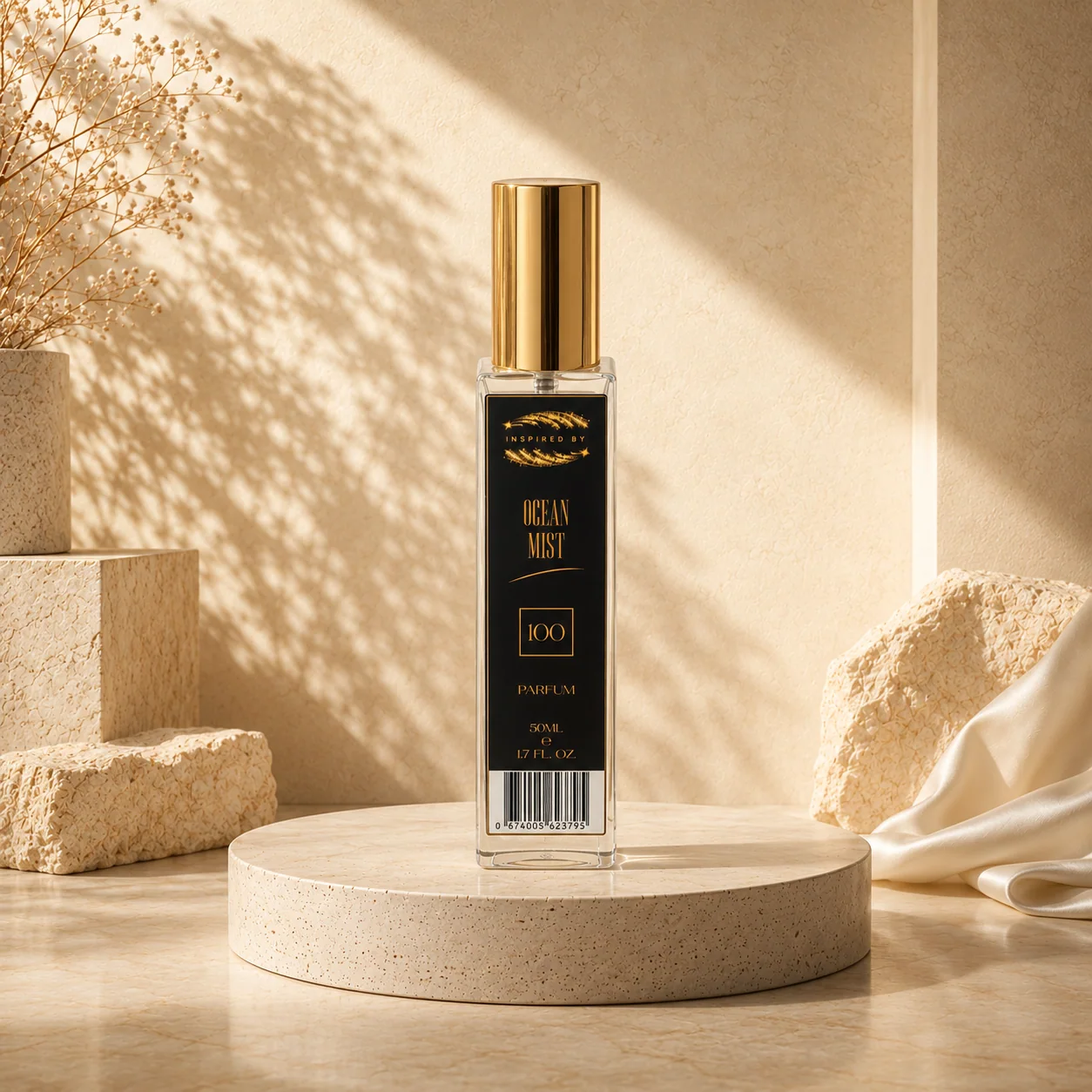
The same fragrance presented in a dramatic dark-and-gold scene and a softer, warm neutral setting, with consistent product identity across both.
Have a brand project in mind?
From brand identity and packaging to websites and printed materials, DigiMade can help bring your ideas together.